Working with Ratio Scales


⏹️⏹️⏹️⏹️⏹️⏹️⏹️⏹️⏹️⏹️⏹️⏹️⏹️⏹️⏹️⏹️⏹️⏹️⏹️⏹️⏹️⏹️⏹️

Ratio Scales, Definition, Examples, and Data Analysis

  1. A ratio scale is quantitative with true zero and equal intervals between neighboring points.
  2. A ratio scale of zero means a total absence of the variable you are measuring.
  3. An interval scale does not have any of the above mentions.
  4. Length, area, and population are examples of ratio scales.
  5. The ratio level contains all of the features of the other 3 levels.
  6. At the ratio level, values can be categorized, and ordered, have equal intervals, and take on a true zero.
  7. Nominal and ordinal variables are categorical variables
  8. Interval and Ratio variables are quantitative variables
  9. Many more statistical tests can be performed on quantitative than categorical data


So What is a True Zero?? 🟥🟥🟥🟥🟥🟥🟥

  1. On a ratio scale, a zero means there's a total absence of the variable of interest.
    1. For example, the number of children in a household or years of work experience are ratio variables.
    2. A respondent can have no children in their household or zero years of work experience.
  2. With a true zero in your scale, you can calculate ratios of values.
    1. For example, you can say that 4 children are twice as many as 2 children in a household and eight years is double 4 years of experience
  3. Some variables, such as temperature, can be measured on different scales
    1. Celcius and Fahrenheit are interval scales
    2. Kelvin is a ratio scale
    3. In all three scales, there are equal intervals between neighboring points
    4. The Kelvin scale has a true zero, where nothing can be colder.
    5. That means that you can only calculate ratios of temperatures in the Kelvin scale
    6. A true zero makes it possible to multiply, divide, or square root values.
    7. Collecting data on a ratio level is always preferable to the other levels because it is the most precise.

Examples of ratio scales  ⏹️⏹️⏹️⏹️⏹️⏹️⏹️

  • Interval variables and ratio variables can be discrete or continuous.
  • A discrete variable is expressed only in countable numbers
  • A continuous variable can potentially take on an infinite number of values.

  • Number of vehicles owned in the last 10 years                                 discrete
  • The number of people in a household                                                      discrete
  • The number of students who identify as religious                                           discrete
  • reaction time in a computer task                                                                 continuous
  • Years of work experience                                                                                      continuous
  • Speed in miles per hour                                                                                      continuous


🟥🟥🟥🟥🟥🟥🟥🟥🟥🟥🟥🟥🟥🟥🟥🟥🟥🟥🟥🟥🟥🟥🟥🟥🟥


Ratio Data Analysis


  1. After you have collected ratio data, then you can gather descriptive and inferential statistics
  2. Almost all statistical tests can be performed on ratio data because all mathematical operations are permissible
  • Ratio data example - you collect data on the commute duration of employees in a large city
      • the data is continuous and in minutes
  • To summarize your data, you can collect the following descriptive statistics :
    • the frequency distribution in numbers or percentages
    • the mode, median, or mean to find the central tendency
    • the range, standard deviation, and variance to indicate the variability
  • You can get an overview of the frequency of different values in a table and visualize their distribution in a graph

  • Enter your data into a grouped frequency distribution table.
  • Create groups with equal intervals on the left-hand column and enter the number of scores that fall within each interval into the right-hand column.
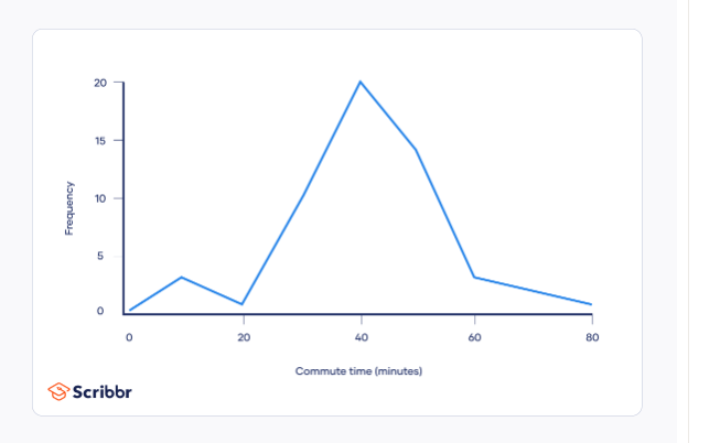
  1. To visualize the data, plot it on a frequency distribution polygon.
  2. Plot the groupings on the x-axis and the frequencies on the y-axis
  3. Join the midpoint of each grouping using lines
Variability
  1. The range, standard deviation and variance describe how spread your data is.
  2. The range is the easiest to compute
  3. The standard deviation and the variance describe how spread your data is and they are also more informative.
  4. The coefficient of variation is a measure of spread that only applies to ratio variables
Range
  • To find the range subtract the lowest value from the highest value in your data set.
    • the range equals72.5 - 7 = 65.5
Statistical Tests

  • With a normal distribution of ratio data then parametric tests are best for testing hypotheses
  • Parametric tests are more powerful than non-parametric tests and you can make stronger conclusions with your data
  • The data must meet several requirements for parametric tests to apply
  • The following chart lists parametric tests that are some of the most common ones applied to test hypotheses about ratio data


🟥🟥🟥🟥🟥🟥🟥🟥🟥🟥🟥🟥🟥🟥🟥🟥🟥🟥🟥🟥🟥🟥🟥🟥

References

Bhandari, P. (2020, August 28). Ratio Scales | Definition, Examples, & Data Analysis. Scribbr. https://www.scribbr.com/statistics/ratio-data/


Ordinal Data:


Need help with ordinal data??

🟥🟥🟥🟥🟥🟥🟥🟥🟥🟥🟥🟥🟥🟥🟥🟥🟥🟥🟥🟥🟥🟥🟥🟥🟥🟥🟥🟥🟥🟥🟥

  • Ordinal data
    • classified into categories within a variable that has a natural rank order.
      • However, the distances between the categories are uneven or unknown.
      • For example, the variable frequency of physical exercise can be categorized into the following:


There is a clear order to these categories, but we cannot say that the difference between never and rarely is exactly the same as that between sometimes and often - therefore the scale is ordinal.

🟥🟥🟥🟥🟥🟥🟥🟥🟥🟥🟥🟥🟥🟥🟥🟥🟥🟥🟥🟥🟥🟥🟥🟥🟥🟥🟥


  • Ordinal is the second of four hierarchical levels of measurement
    • nominal, ordinal, interval, and ratio
  • Nominal data differs from ordinal data because it cannot be ranked in an order. 
  • Interval data differs from ordinal data because the differences between adjacent scores are equal.

🟥🟥🟥🟥🟥🟥🟥🟥🟥🟥🟥🟥🟥🟥🟥🟥🟥🟥🟥🟥🟥🟥🟥🟥🟥🟥🟥🟥🟥

Examples of Ordinal Scales:


  • In social scientific research, ordinal variables often include ratings about opinions or perceptions, or demographic factors that are categorized into levels or brackets such as social status or income.
    • Language ability
      • beginner
      • intermediate
      • fluent
    • level of agreement
      • strongly disagree
      • disagree
      • neither agree nor disagree
      • agree strongly agree
    • Income level
      • lower level income
      • middle-level income
🟥🟥🟥🟥🟥🟥🟥🟥🟥🟥🟥🟥🟥🟥🟥🟥🟥🟥🟥

How to Collect Ordinal Data 

  • ordinal variables are usually assessed using closed-ended survey questions that give participants several possible answers to choose from. These are user-friendly and let you easily compare data between participants.
⏹️⏹️⏹️⏹️⏹️⏹️⏹️⏹️⏹️⏹️⏹️⏹️⏹️⏹️
Examples of Ordinal scale survey questions

  • what is your age
    • 0 to 18
    • 19 to 34
    • 35 to 49 
    • 50 plus
  • what is your education level
    • primary school
    • high school
    • bachelors degree
    • master's  degree
    • PhD
  • In the past three months, how many times did you buy groceries online
    • none
    • 1 to 4 times
    • 5 to 9 times
    • 10-14 times
    • 15 or more times
⏹️⏹️⏹️⏹️⏹️⏹️⏹️⏹️⏹️⏹️⏹️⏹️⏹️⏹️⏹️⏹️⏹️⏹️⏹️⏹️⏹️⏹️⏹️⏹️⏹️⏹️⏹️⏹️


Likert Scale Data

Ordinal data is often collected using Likert scales. Likert scales are made up of 4 or more Likert type questions with continuum of response items for participants to choose from


Example of Likert-type questions 


  • How frequently do you buy energy-efficient products?
    • never
    • rarely
    • sometimes
    • often
    • always
  • How important do you think it is to reduce your carbon footprint?
    • not important
    • slightly important
    • important
    • moderately important
    • very important
  • But it's important to note that not all mathematical operations can be performed on these numbers
    • Although you can say that two values in your data set are equal or unequal
    • you can say that one value is greater or less than another.
    • You cannot meaningfully add or subtract the values from each other.
      • This becomes relevant when gathering descriptive statistics about your data.
How to Analyze Ordinal Data⏹️⏹️⏹️⏹️⏹️⏹️

  • Ordinal data can be analyzed with both descriptive and inferential statistics.

Descriptive Statistics⏹️⏹️⏹️⏹️⏹️

  • With Ordinal Data
    • the frequency distribution in numbers or percentages. 
    • the mode or the median to find the central tendency
    • the range to indicate the variability
  • Example 
    • You ask 30 survey participants to indicate their level of agreement with the statement below
      • Regular physical exercise is important for my mental health.
        • strongly disagree
        • disagree
        • neither disagree nor agree
        • agree
        • strongly agree

 ⏹️⏹️⏹️⏹️⏹️⏹️⏹️⏹️⏹️⏹️⏹️⏹️⏹️⏹️

To get an overview of your data, you an create a frequency distribution table that tells you how many times each response was selected

To visualize your data, you can use a bar graph
  • Plot your categories on the x-axis and the frequencies on the y-axis
  • Unlike nominal data,

    the order of categories matters when displaying ordinal data.

Central Tendency⏹️⏹️⏹️⏹️⏹️⏹️⏹️⏹️

The central tendency of your data is where most of your values lie
  • The mode, mean, and median are the three most commonly used measures of central tendency.
    • the mode can almost always be found for ordinal data
    • the median can only be found in some cases.
    • The mean can not be computed with ordinal data
      • finding the mean requires you to perform arithmetic operations like addition and division on the values in the data set
      • the differences between adjacent scores are unknown with ordinal data, these operations can not be performed for meaningful results.
      • the mode of your data is the most frequently appearing value.
        • the mode of the data set is agree
⏹️⏹️⏹️⏹️⏹️⏹️⏹️⏹️⏹️⏹️⏹️⏹️

Medians
  • for odd and even numbered data sets are found in different ways
    • in an odd numbered data set the median is the value at the middle of your data set when it is ranked.
    • In an even-numbered data set, the median is the mean of the two values in the middle of your data set.


  • Order all data values and locate the middle of your data set to find the median
    • Since there are 30 values, there are 2 values in the middle at the 15th and 16th positions since both values are the same the median is Agree
    • If the two values in the middle were Agree and Strongly agree instead, then you could not find the mean since the mean of the two values can't be found even if you coded them numerically - so in this case there is no median.
⏹️⏹️⏹️⏹️⏹️⏹️⏹️⏹️⏹️⏹️⏹️⏹️⏹️
Variability

  • Find the minimum, maximum, and range of your data set
    • code your data by assigning a number to each of the responses in order from lowest to highest.
      • 1 strongly disagree
      • 2 disagree
      • 3 neither disagree nor agree
      • 4 agree
      • 5 strongly agree
The minimum is 1 and the maximum is 5

  1. The range gives you an idea of how widely your scores differ from each other.
  2. From this information, you can conclude there was at least one answer on either end of the scale.

From this information, you can conclude there was at least one answer on either end of the scale.

Statistical Tests

  1. Inferential statistics will help you test scientific hypotheses about your data
  2. The most appropriate statistical tests for ordinal data focus on the rankings of your measurements and these just happen to be non-parametric tests
  3. Parametric tests are used when your data fulfills certain criteria like a normal distribution
  4. Parametric tests assess means
  5. non-parametric tests often assess medians or ranks.
  6. There are many possible statistical tests that you can use for ordinal data.
  7. The one you choose depends on your aims and the number and type of samples


🟥🟥🟥🟥🟥🟥🟥🟥🟥🟥🟥🟥🟥🟥
References


 Bhandari, Pritha. “Ordinal Data: What Is It and What Can You Do with It?” Scribbr, 12 Aug. 2020, www.scribbr.com/statistics/ordinal-data/.


Requiem for a Teaspoon: A Caffeinated Elegy


The Caffeinator: Dawn of Toxicity


🌡️🌡️🌡️🌡️🌡️🧊🧊🧊🧊🧊🧊🧊🧊🧊🧊🧊🧊🧊🧊 

Pure and highly concentrated caffeine products pose a significant public health risk due to their potency and potential for overdose. These products, often sold in bulk and packaged without precise measuring tools, contain dangerously high levels of caffeine - a single teaspoon of powder can be equivalent to 28 cups of coffee.  (Nutrition, 2023)


According to the FDA's 2023 article  (Nutrition, 2023), common side effects like nervousness are magnified, and potentially fatal consequences like seizures and rapid heartbeat can occur. Consumers unaware of this potency compared to regular coffee are particularly at risk. The FDA actively monitors and takes action against these products, including seizure and injunctions according to their recently published article (Nutrition, 2023). 

According to Nutrition (2023), the following is a timeline on the FDA's action on pure and highly concentrated caffeine:

  1. On September 1, 2015 - the FDA issued warning letters to five distributors of pure powdered caffeine products.
  2. March 2016 - The FDA issued two additional warning letters
  3. On April 13, 2018, the FDA released guidance for the industry on highly concentrated caffeine in dietary supplements
    1. This document provides guidance for companies who manufacture, market, or distribute dietary supplements containing pure or highly concentrated caffeine or are considering doing so, to help them determine when a product is considered adulterated and illegal by the FDA

🟥🟥🟥🟥🟥🟥🟥🟥🟥🟥🟥🟥🟥🟥🟥🟥🟥🟥🟥🟥🟥🟥🟥

 References

  1. Nutrition, C. for F. S. and A. (2023). Pure and Highly Concentrated Caffeine. FDA. https://www.fda.gov/food/dietary-supplement-ingredient-directory/pure-and-highly-concentrated-caffeine


Decoding the Data Whisperer:

 A Beginner's Guide to Z-Scores

🟥🟥🟥🟥🟥🟥🟥🟥🟥🟥🟥🟥🟥🟥


Imagine you're in a classroom full of students who all took the same exam. You scored 75, but how does that compare to everyone else? Did you ace it or just barely scrape by? Enter the z-score, a powerful tool that helps you understand your position within a dataset.


Think of z-scores as a translator. It takes your raw score and converts it into a universal language, telling you how many standard deviations away you are from the mean or average of the group. S standard deviation is basically a measure of how spread out the data is.


The lowdown on z-scores:


The Formula:


Interpretation:

Positive z-score means you scored above the mean, The higher the z-score, the further above the mean you are. For example, a z score of 2 means that you are 2 standard deviations above the average.


A negative z score means that you scored below the mean. The more negative the z-score, the further below the mean you are. 


A z-score of 0 then you are right on the mean.


Benefits of Z-Scores:
  1. you can compare apples to oranges. You can compare data from different sets with different units. Imagine comparing your exam score to your friend's height. Z-scores make it possible by putting both scores on the same scale.
  2. Spot outliers: Extreme values that deviate significantly from the rest of the data can be easily identified with z-scores. A z-score far above or below the others might indicate an error or a unique case that deserves further investigation.
  3. Predict probabilities: Knowing the z-score and the properties of the normal distribution-  the bell curve-, you can estimate the percentage of the population that scored lower or higher than you.


For Whom the Bell Curves

From Gambling Odds to Universal Truth


🧪🧪🧪🧪🧪🧪🧪🧪🧪🧪🧪🧪🧪🧪🧪🧪🧪🧪🧪🧪

Have you ever wondered why test scores, heights, and even plant sizes seem

to follow a predictable pattern? The answer lies in a mysterious bell-shaped curve known as the normal distribution. But this ubiquitous curve was not just handed down on a silver platter - it emerged from the mind of a brilliant mathematician named Abraham De Moivre in the 18th century (Nesselroade & Grimm, 2020).


  • De Moivre, a friend of legends like Halley and Newton, was not interested in boring old graphs. He was fascinated by the odds of chance, specifically the probability of flipping a coin a thousand times and getting between 500 and 600 heads. As he crunched the numbers, something magical happened, the results began to form a bell-shaped curve.
  • 🟰🟰🟰🟰🟰🟰🟰🟰🟰🟰🟰🟰🟰🟰🟰🟰🟰🟰🟰🟰🟰🟰🟰🟰

  • But how did he get that iconic formula with its mysterious constants like pi and e? Well, that's a secret lost to the writing style of the time, where results were proudly displayed but methods remained tightly under wraps (Nesselroade & Grimm, 2020). It's a tantalizing glimpse into De Moivre's mind, bending seemingly unrelated fields like gambling and geometry to birth a universal truth. 

🌡️🌡️🌡️🌡️🌡️🌡️🌡️🌡️🌡️🌡️🌡️🌡️🌡️🌡️🌡️🌡️🌡️🌡️

While De Moivre laid the groundwork, others helped the bell curve ring far and wide. Thomas Simpson extended it to continuous measurements like star positions, proving that averaging multiple observations in the sky is the key to minimizing error. Then came Pierre Leplace with his Central Limit Theorem, the grandaddy of statistics, showing that the average of many samples from a population tends to follow a normal distribution  (Nesselroade & Grimm, 2020).

  This opened the door to using the curve for all sorts of hypothesis testing and probability calculations

And who can forget Carl Gauss, the mathematical prodigy who discovered an error in his father's payroll at the age of 3 (Nesselroade & Grimm, 2020)? He not only popularized the normal distribution but also used to predict the reappearance of a lost asteroid with just a handful of observations. Talk about putting your theories to the test!!

Today, the normal curve is the bedrock of statistics, guiding everything from test score analysis to market research. It is a testament to the power of human curiosity and the unexpected connections that can lead to groundbreaking discoveries. So, the next time you see a bell curve, remember De Moivre, Simpson, Laplace, and Gauss - the pioneers who unlocked the secrets hidden within the randomness of numbers.

🧪🧪🧪🧪🧪🧪🧪🧪🧪🧪🧪🧪🧪🧪🧪🧪🧪🧪 

 References

 Nesselroade, P. K. & Grimm, L. G. (2020). Statistical applications for the behavioral and social sciences (2nd ed.). Soomo Learning. https://www.webtexts.com

The Unsung Hero of Statistics

 William Gosset and the Revolution of Small Samples.

🟦🟦🟦🟦🟦🟦🟦🟦🟦🟦🟦🟦🟦🟦🟦🟦🟦🟦🟦🟦🟦🟦🟦🟦🟦🟦🟦🟦


  • In the early 20th century, the world of statistics was dominated by one assumption: large numbers mattered(Nesselroade & Grimm, 2020). But for William Gosset, a chemist brewing ale at Guinness, small samples held untold insights. His revolutionary work on t-distribution and t-tests not only transformed statistics but opened the door to scientific advancements in countless fields.
📅📅📅📅📅📅📅📅📅📅📅📅📅📅
Imagine trying to determine the best barley for brewing with only a handful of samples. Traditional methods, relying on the z distribution and massive datasets were useless. Gosset realized the need for a new approach, one that could unveil the secrets hidden within small collections of data.

👀👀👀👀👀👀👀👀👀👀👀👀👀

His 1908 paper, "The Probable Error of a Mean," was a beacon in the statistical darkness. He recognized the limitations of the z curve and birthed the t distribution, a bell curve uniquely tuned to the whispers of small data. Armed with this new tool, Gosset crafted the t-test, a powerful technique for comparing means from two small samples. (Nesselroade & Grimm, 2020)

🧪🧪🧪🧪🧪🧪🧪🧪🧪🧪

For the first time, scientists could draw meaningful conclusions from limited data. Imagine comparing the effectiveness of two fertilizers on corn yields or testing the shelf life of different brewing temperatures. Gosset's innovations made such discoveries possible, unlocking a new era of scientific inquiry.

🪟🪟🪟🪟🪟🪟🪟🪟🪟🪟🪟🪟

Yet, Gosset's work wasn't met with immediate fanfare. He published under the pseudonym "Student" due to Guinness's restrictive publication policies. The irony was not lost on him; a man revolutionizing statistics had to hide his name. While some colleagues met his ideas with weighty apathy others recognized their brilliance. Ronald Fisher, a statistical giant himself, acknowledged Gosset's work as one of the most important publications in the history of inferential statistics.(Nesselroade & Grimm, 2020) 

🏳️‍🌈🏳️‍🌈🏳️‍🌈🏳️‍🌈🏳️‍🌈🏳️‍🌈🏳️‍🌈🏳️‍🌈🏳️‍🌈🏳️‍🌈🏳️‍🌈🏳️‍🌈🏳️‍🌈

Today, the t-test reigns supreme in countless scientific disciplines. From psychology and medicine to agriculture and business, it forms the backbone of countless research endeavors. Every time a scientist makes a claim based on small sample data, they pay homage to Gosset's legacy.


Gosset's story is more than just statistics; it's a testament to the power of curiosity and perseverance. He dared to challenge the status quo, venturing into the realm of the unknown and returning with tools that reshaped the scientific landscape. In an era obsessed with big data, his work reminds us that sometimes, the smallest whispers can hold the loudest truths.

🟥🟥🟥🟥🟥🟥🟥🟥

References


 Nesselroade, P. K. & Grimm, L. G. (2020). Statistical applications for the behavioral and social sciences (2nd ed.). Soomo Learning. https://www.webtexts.com

The Three Musketeers of Math: Mean, Median, and Mode

 Mean, Median, and Mode


🟰🟰🟰🟰🟰🟰🟰🟰🟰🟰🟰🟰🟰🟰🟰🟰🟰🟰🟰🟰🟰🟰🟰🟰🟰🟰🟰
Statistics is very intimidating to me and is kicking my ass this semester, so writing these blogs and relating them to something fun really helps me commit it to memory. So today I am introducing the Three Musketeers of Math: Mean, Median, and Mode. These swashbuckling statistics will help you understand any dataset like Zorro deciphers a secret message.

🌡️🌡️🌡️🌡️🌡️🌡️🌡️🌡️🌡️🌡️🌡️🌡️🌡️

Meet the Crew

  • The Average Avenger: Mean is the sum of all the values of your data divided by the number of values. Think of it as sharing a pizza equally among your friends. Everyone gets a slice. 
  • The Middle Mastermind: Median is the value that splits your data in half when ordered from least to greatest. Imagine lining up your friends by height. The median friend is smack dab in the middle, not the shortest or the tallest.
  • The Most Popular Posse: Mode is the value that appears most often in your data. It's like the friend who always shows up to parties, the life of the statistical soiree.

When to Call on Each Musketeer

Each Musketeer has their strengths and weaknesses. Mean is great for normally distributed data - think bell curve, but gets thrown off by outliers- think your friend who brought three extra pizzas - skewing the average. The median shines when you have skewed data or outliers, but it doesn't consider all the values like the mean does. Mode is all about popularity, but it can be unreliable is there's no clear favorite value- think of friends who are all equally awesome in their own way.

 🟥🟥🟥🟥🟥🟥🟥🟥🟥🟥


The Musketeers in action

Let's say you're tracking your video game scores: 10, 20, 30,30,40,50


  • The mean:( 10 +20+30+30+40+50) /6 = 30
  • The Median: Order the scores (10,20,30,30,40,50) the middle value is 30.
  • Mode: 30 appears twice, making it the most popular score.
 

The Mean, Median, and Mode are not rivals, they're complementary! Use them together to paint a richer picture of your data,

The Incredible Experiment:

 A Superhero Guide to Independent and Dependent Variables


🧊🧊🧊🧊🧊🧊🧊🧊🧊🧊🧊🧊🧊🧊🧊🧊🧊🧊🧊🧊🧊🧊🧊🧊🧊🧊

Ever dreamed of being a scientist, wielding potions and peering through microscopes? Let us embark on a scientific adventure, unraveling the secrets of independent and dependent variables, your super tools for understanding the world around you!


Imagine a superhero lab


  • Professor Potential who is our wise mentor, mixing bubbling concoctions and spouting scientific wisdom.
  • Experiment X who is our trusty robot sidekick, ready for any test.
  • The question is will Professor Potential's new super-strength serum actually work on experiment X


The Key Players

  • Independent Variable - aka The Twister: This is the variable we change or control in our experiment. Just like Professor Potential changing the formula of the serum, the independent variable gets twisted and turned to see its effect.\
  • Dependent Variable - aka the Detector: This is the variable we measure or observe to see how it reacts to the changes in the independent variable. Experiment X will lift weights to see if his strength increases - that is the dependent variable, the detector of the serum's power.

The Big Showdown:


Professor Potential whips up different serums, changing the amount to a special ingredient which is the independent variable. Experiment X gulps them down and lifts weights with all his might. We measure how much he lifts which is the dependent variable - does it skyrocket with each new formula? 

The Reveal:


If Experiment X is suddenly bench pressing cars after the super-strength serum, it means the independent variable which is the serum formula has a clear effect on the dependent variable which is the weight lifted. If he is still struggling with tiny dumbbells, well, back to the lab!


  • The Independent variable controls the show, the variable we twist and turn.
  • The dependent variable watches the results, the variable that changes or doesn't in response.


Are Werewolves Real??

 Investigating the Moon and Relapse with Statistics

🧪🧪🧪🧪🧪🧪🧪🧪🧪🧪🧪🧪🧪🧪🧪🧪🧪🧪🧪🧪🧪🧪🧪🧪🧪🧪🧪

Ever heard that full moons bring out the crazies? Or maybe just a few extra patients in the emergency room? While the image of howling werewolves might be exaggerated, the question of a lunar influence on human behavior persists. Today, we'll put on our lab coats and use statistics to investigate the fascinating and often debated connection between moon phases and relapse rates.

🌡️🌡️🌡️🌡️🌡️🌡️🌡️🌡️

The Suspect: Luna, the Earth's Satellite


Lunar lore spans centuries, with beliefs linking the moon to everything from tides to fertility. But for our investigation, the focus is on potential changes in human physiology or psychology based on the moon's phases. Some theories suggest gravitational or electromagnetic forces might play a role, while others point to altered sleep patterns or increased suggestibility under a full moon.

Gathering Evidence: The Power of Data

To test these theories, we need data. Lots of it. This means tracking relapse rates for specific conditions like addiction, and mental health episodes over time, alongside the corresponding lunar phases.

The Statistical Sleuthing:


Here's where the real fun begins! We can use various statistical tools to examine the data and see if there is any connection between phases and relapse. Let's explore some possibilities:
  • Chi-square test: This tests whether the observed distribution of relapses across lunar phases is different from what we would expect by chance.
  • Correlation coefficient: This measures the strength and direction of any relationship between lunar phases and relapse rates.
  • Regression analysis: This allows us to control for other factors that might influence relapses
     such as seasonality or weather, and see if the moon effect remains significant.
Even if some studies show a faint lunar link, it's crucial to remember correlation does not equal causation because there could be other, unknown factors at play.

So, are werewolves real? Based on current research, probably not. But the moon's influence on human behavior remains a captivating mystery. Statistical analysis helps us piece together the clues, but until the evidence speaks louder, we should maintain a healthy dose of skepticism and keep exploring.

Remember, science is a journey, not a destination. And in the realm of lunar mysteries, every full moon might just bring us a new chapter
in the story.


Data Detective:

 Cracking the Case of Interval and Ratio Data!!!

🧊🧊🧊🧊🧊🧊🧊🧊🧊🧊🧊🧊🧊🧊🧊🧊🧊🧊🧊🧊🧊🧊🧊🧊🧊🧊🧊
Remember the thrilling mystery novels where clues whisper secrets and numbers hold hidden truths? Well, buckle up, fellow data detective, because this time we are cracking the case of interval and ratio data!


Gone are the days of simple yes or no answers - nominal data- or rankings without measurements - ordinal data. Now we are dealing with numbers that sing, dance, and reveal fascinating secrets about the world around us.


Interval data 


Imagine a thermometer. It displays degrees, from freezing cold to scorching hot, but there's no true zero. Zero on a thermometer does not mean the absence of heat, just some arbitrary starting point. That is interval data: numbers with equal differences, but no absolute reference point.


Think of it like a ruler. Each centimeter is the same, but you would not say a book measured at zero centimeters is nonexistent. It just starts at a different point than your ruler's zero.

🌡️🌡️🌡️🌡️🌡️🌡️🌡️🌡️🌡️🌡️🌡️🌡️🌡️🌡️


Ratio data


Now, picture a fancy scale, measuring your weight with a precise zero. This my friends is ratio data. It has all the benefits of interval data - equal differences - but with an added superpower: a true absolute zero. ero weight means no weight at all, not just some starting point in a system.

👀👀👀👀👀👀

Think of time: zero seconds is truly the absence of time, not just a starting point for your stopwatch. 

So what is the difference????

Imagine a race: With interval data, you know who came first, second, and third, but not their exact times. Ratio data reveals everyone's exact finishing times, allowing you to calculate speeds, and gaps, and even predict future winners!

Why does it matter???🟥🟥🟥🟥🟥🟥

Choosing the right data type is like picking the perfect tool for the job. Using interval data for calculations that require a true zero can lead to skewed results, like trying to hammer a nail with a spoon.

So the next time you encounter a set of numbers, don't just stare blankly. Put on your detective hat and ask Interval or ratio? Numbers hold the key to understanding temperature changes, predicting economic trends, and even measuring the speed of that falling toast-ratio
data, by the way.


Let's Sort

 Sorting it out: A Guide to Ordinal and

Nominal Data

🪟🪟🪟🪟🪟🪟🪟🪟🪟🪟🧪🧪🧪🧪🧪🪟🪟🪟🪟🪟🪟🪟🪟🪟🪟🪟

Data, data, everywhere! Numbers dance across spreadsheets, charts bursting with colorful bars...but not all data is created equal. Ordinal and nominal, ever heard of them?


Imagine a movie theatre:
  • The seat numbers tell you where to sit, but there is no inherent order or comparison between them. You would not claim that one seat is better than the other. This is basically nominal data.
  • Picture the rows: front row, middle row! The front row sits closer to the screen, the back row farther, and the middle row falls somewhere in between. Each level has a definite rank compared to the others. This is ordinal data.
🧪🧪🧪🧪🧪🧪🧪🧪🧪🧪🧪🧪🧪🧪🧪🧪🧪🧪🧪🧪🧪🧪🧪🧪🧪🧪

OK what is the difference?

  • Nominal data:
    • Think categories, not ranks. Imagine hair color, political party, or music genre. These are nominal-just labels that group things together without implying any order or inherent relationship.
    • Surveys and questionnaires love them. Ask "What is your favorite color? and you will get nominal data like blue, green, and purple without inherent order just individual categories.
    • Counting and percentages are their forte. We can count how many people like each color, but we cannot say blue is greater than green.
  • Ordinal data
    • Ranks matter! Think movie rows, exam grades, or clothing sizes. These levels have a clear order, each higher than the one below.
    • They tell you more than or less than. A student with an A outperformed someone with a C. A large shirt is bigger than a medium.
    • But beware of stretching the order!! Ordinal data does not always allow for equal intervals between levels. A B student is not necessarily twice as good as a D student.
🧊🧊🧊🧊🧊🧊🧊🌡️🌡️🌡️🌡️🌡️🌡️🌡️🌡️🌡️🌡️🌡️🌡️🌡️🌡️🌡️🌡️🌡️🌡️👀👀👀👀👀👀👀👀👀👀👀👀👀
Why does it matter??

Choosing the right data type is crucial for accurate analysis and meaningful conclusions. Using nominal data for calculations that assume order can lead to misleading results. Conversely, forcing ordinal data into strict mathematical operations might not make sense.


Data is like legos: different pieces fit together in different ways. Knowing which type you're holding is key to building something insightful and robust.

So, next time you see data dancing around, do not be afraid to ask: ordinal or nominal to unlock a hidden story within the numbers. 

🏳️‍🌈🏳️‍🌈🏳️‍🌈🏳️‍🌈🏳️‍🌈🏳️‍🌈🏳️‍🌈🏳️‍🌈🏳️‍🌈🏳️‍🌈🏳️‍🌈🏳️‍🌈

There are other data types out there, like interval and ratio data, each with their own quirks and strengths.

Featured Blog Post

Come Undone: The Psychology of Falling Apart (and Putting Yourself Back Together

Duran Duran's pulsating anthem "Come Undone" isn't just catchy; it's a potent exploration of losing control and the de...

Popular Posts